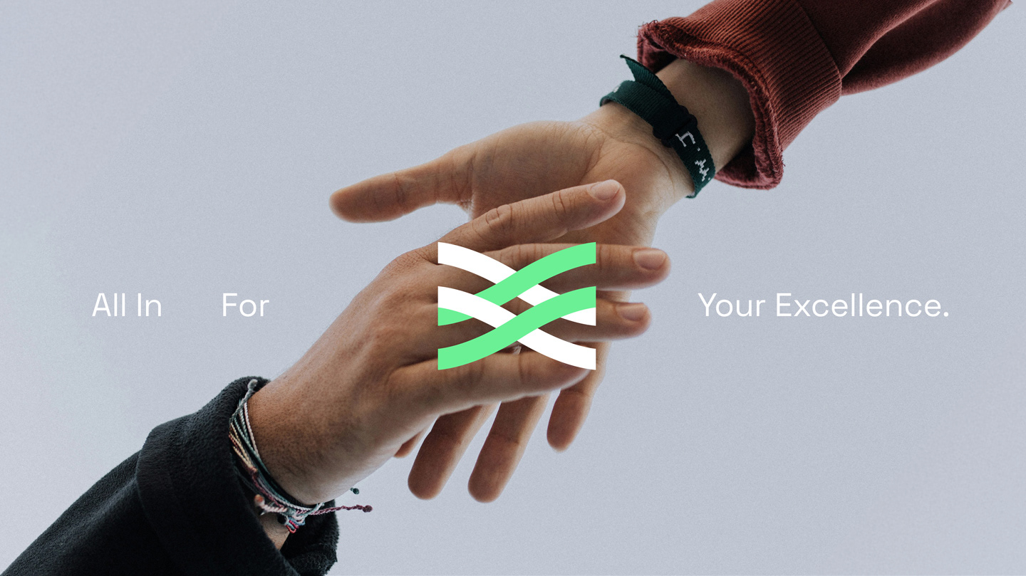
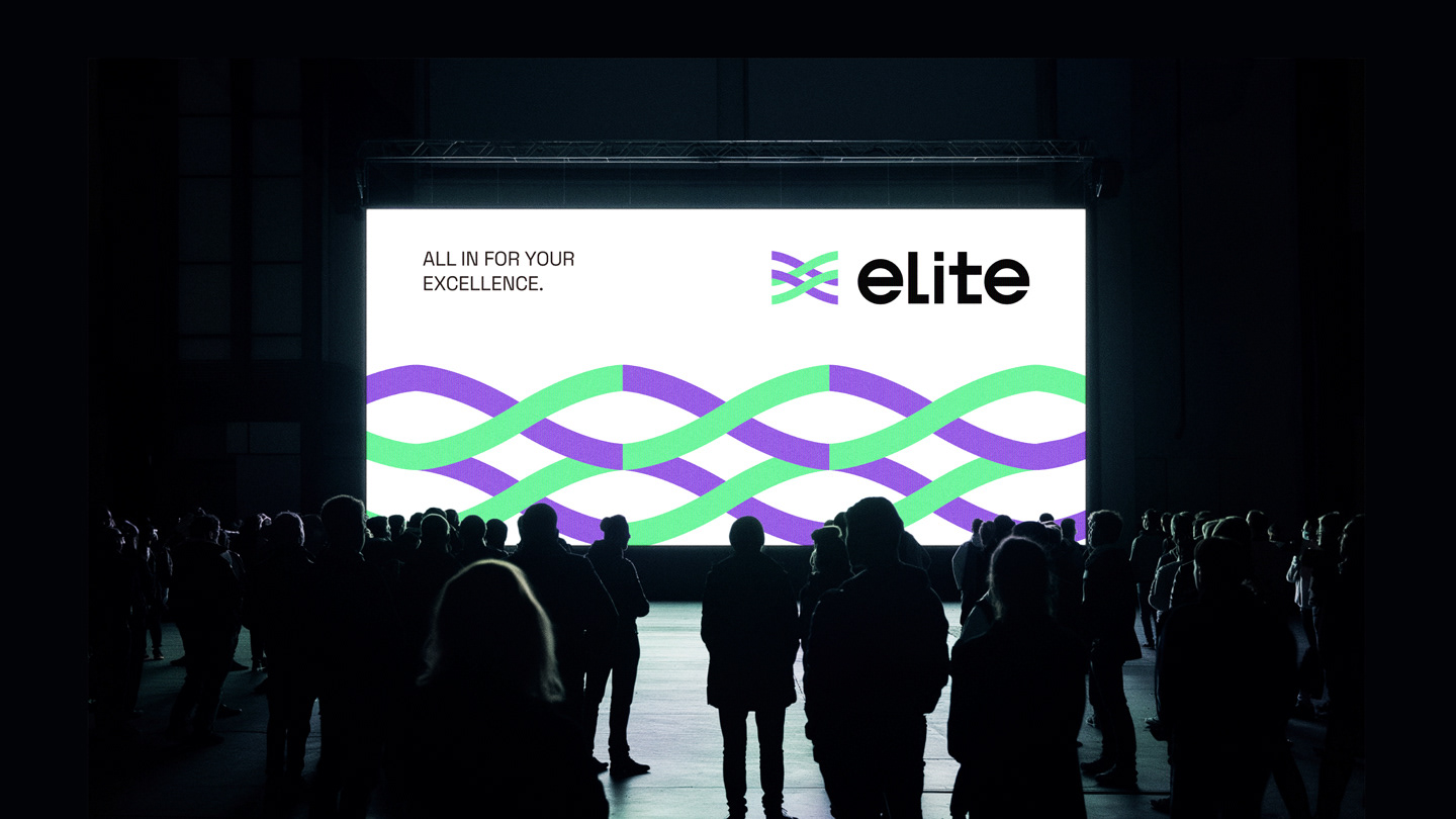
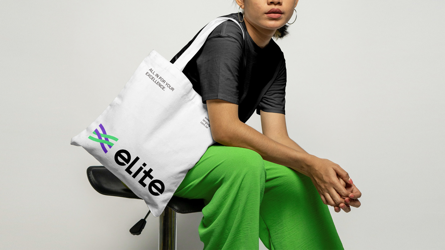
ALL IN FOR YOUR EXCELLENCE
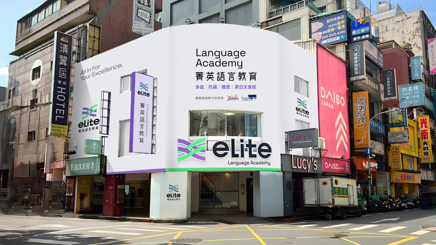
菁英國際語言教育中心是台灣知名的語言補教品牌,提供TOEIC、TOEFL、IELTS、GEPT、JLPT等多元語言檢定課程,並擁有多項官方考場授權,致力於幫助學生與上班族有效提升英語、日語等語言能力。隨著學習族群逐漸年輕化,原有的品牌識別與視覺語言顯得過於嚴肅、距離感強,無法有效吸引新一代學習者及偏好數位學習的使用者。
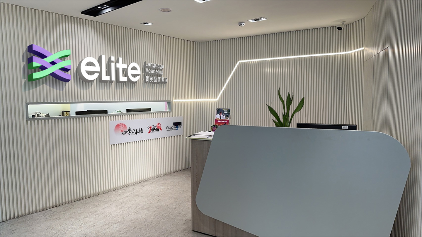
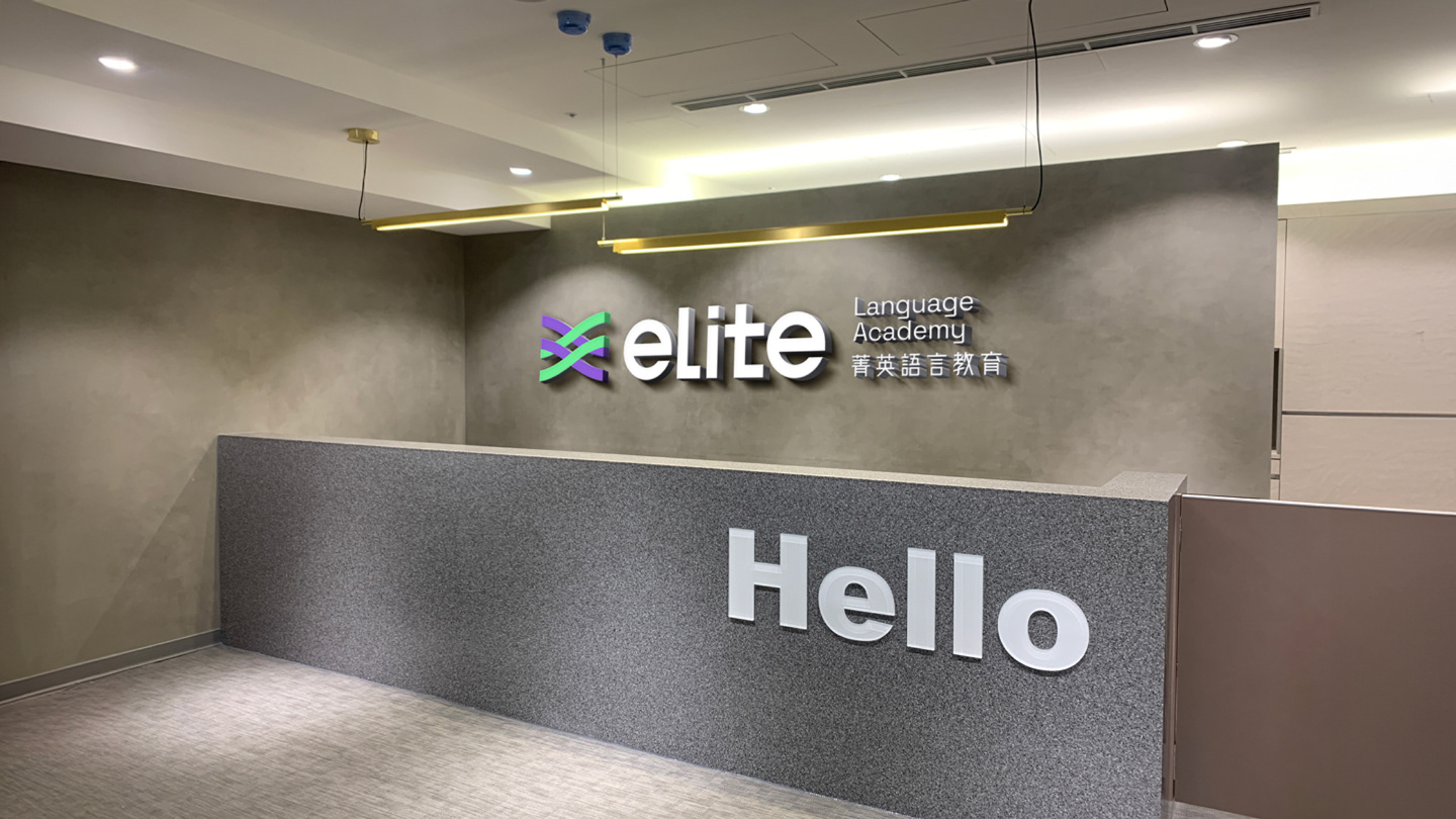
此次設計重塑以創新識別系統與語言風格更新為核心,重新打造專業且具親和力的品牌形象。改版後不僅提升品牌好感度,也顯著強化了市場溝通力,成功拉近與目標族群的連結。
ELITE Language Center is a well-known language education brand in Taiwan, offering a wide range of test preparation programs including TOEIC, TOEFL, IELTS, GEPT, and JLPT. With multiple official test center accreditations, the center is dedicated to helping both students and working professionals effectively improve their English, Japanese, and other language skills. As its target audience has become younger and more digitally inclined, the original brand identity and visual language began to feel overly formal and distant—failing to connect with the new generation of learners.
This rebranding project focuses on developing an innovative identity system and refreshing the brand’s tone of voice to create a professional yet approachable image. The redesign has significantly enhanced brand appeal and communication effectiveness, successfully bridging the gap with its core audience.
DESIGN CONCEPT
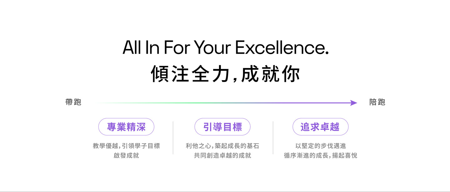
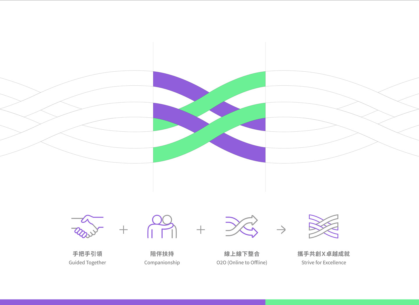
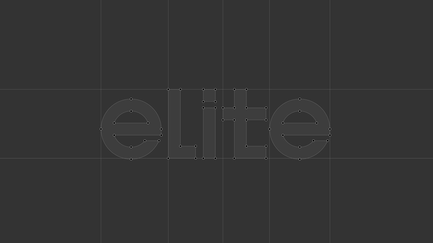
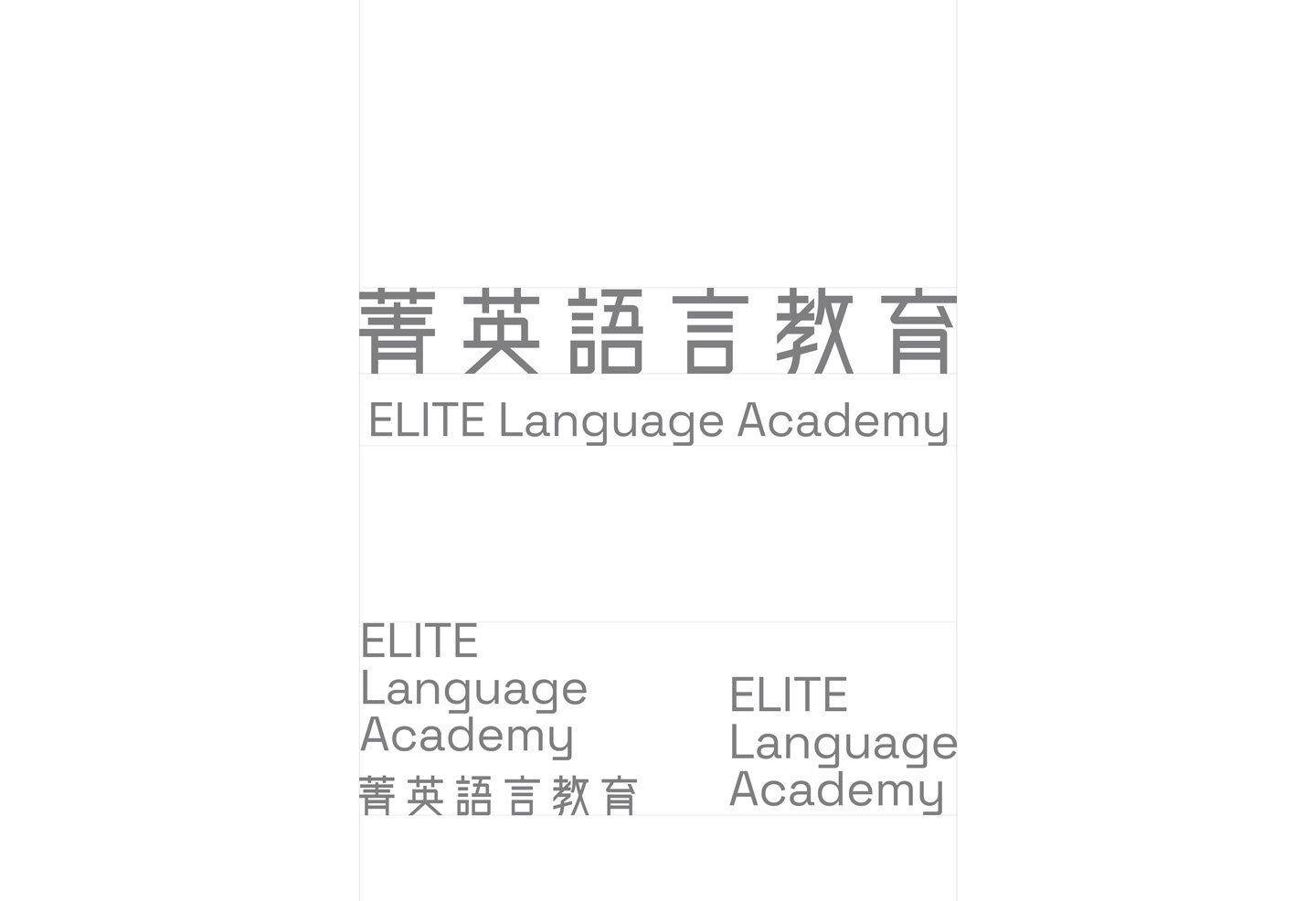
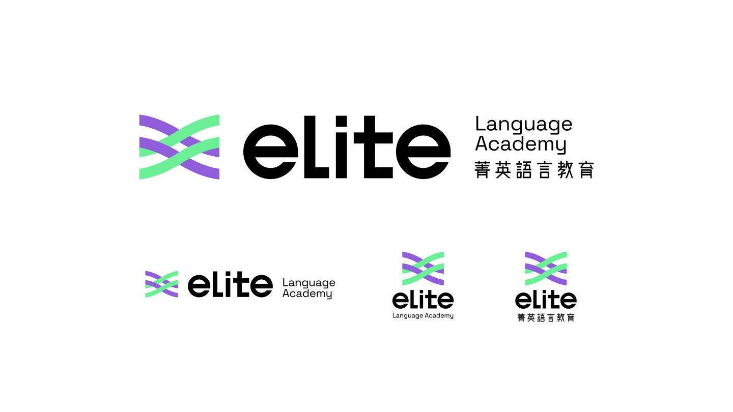
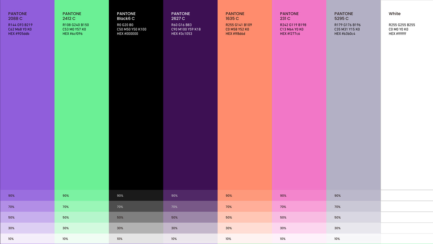
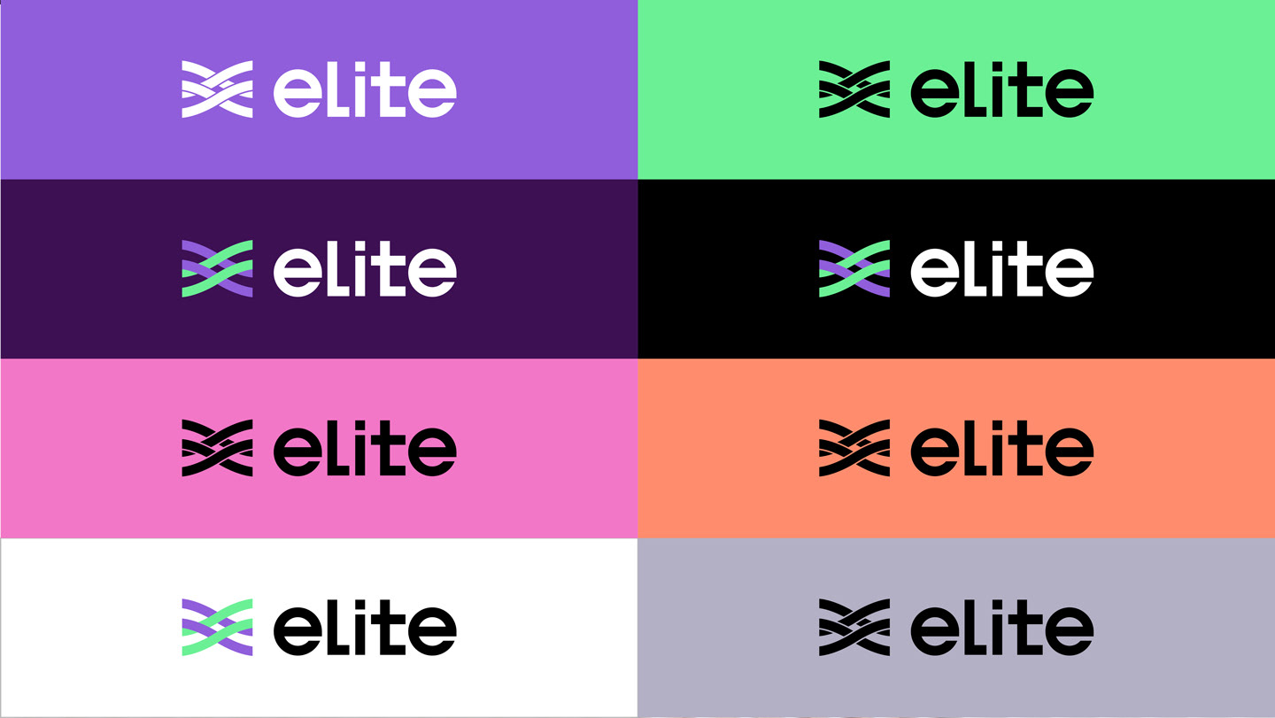
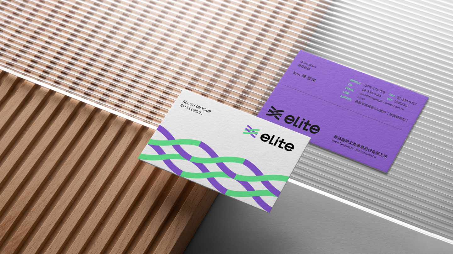
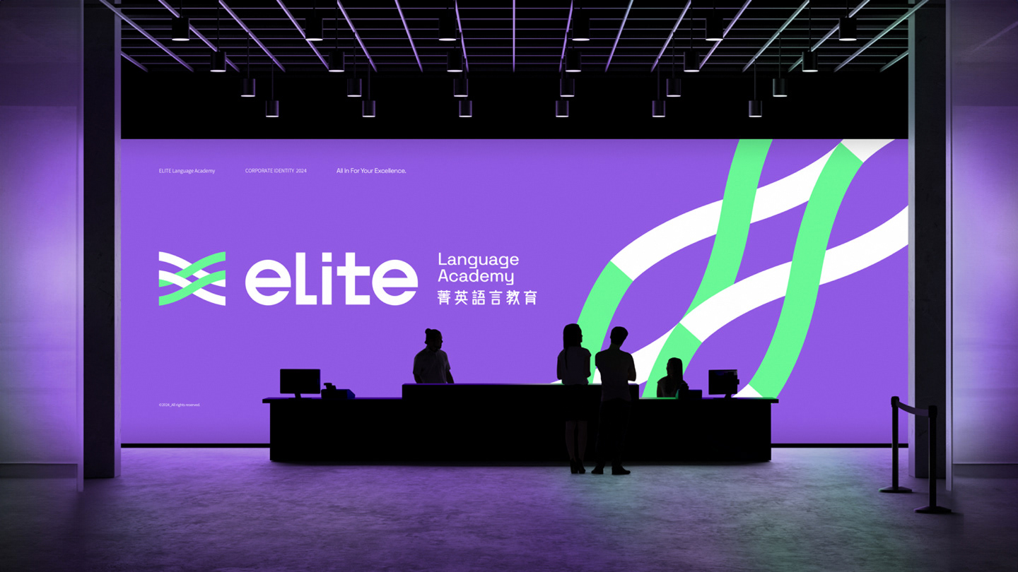
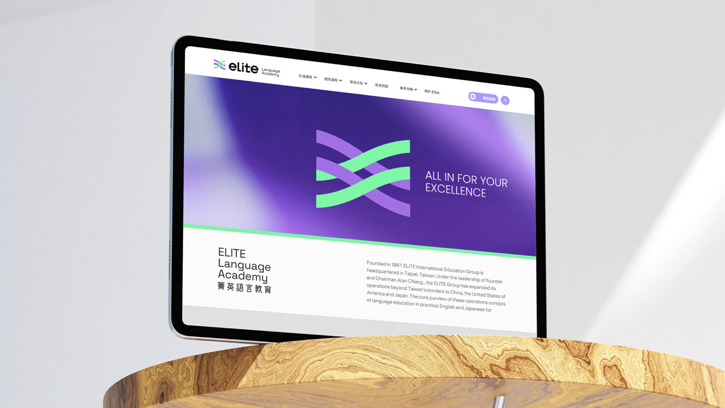
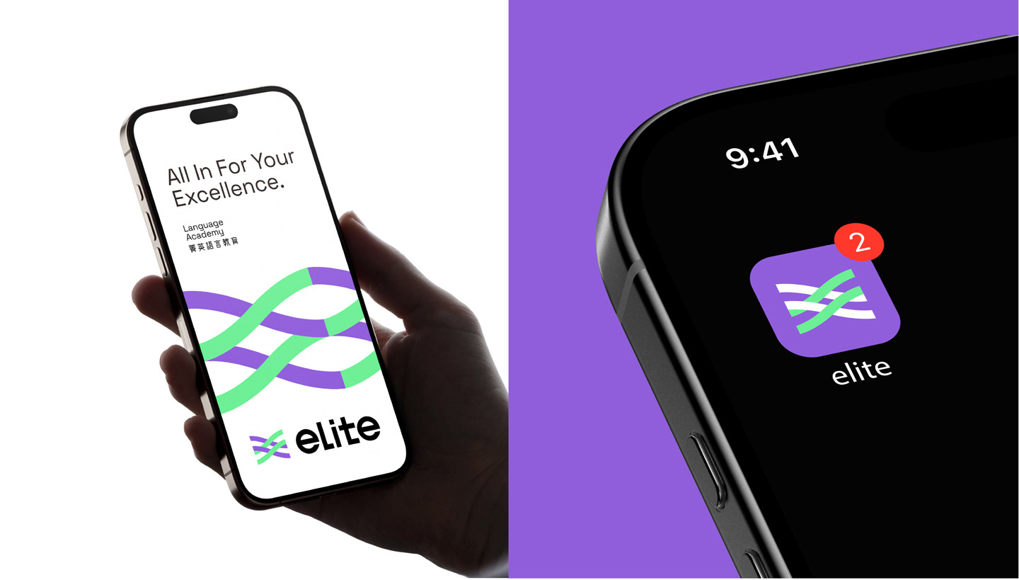
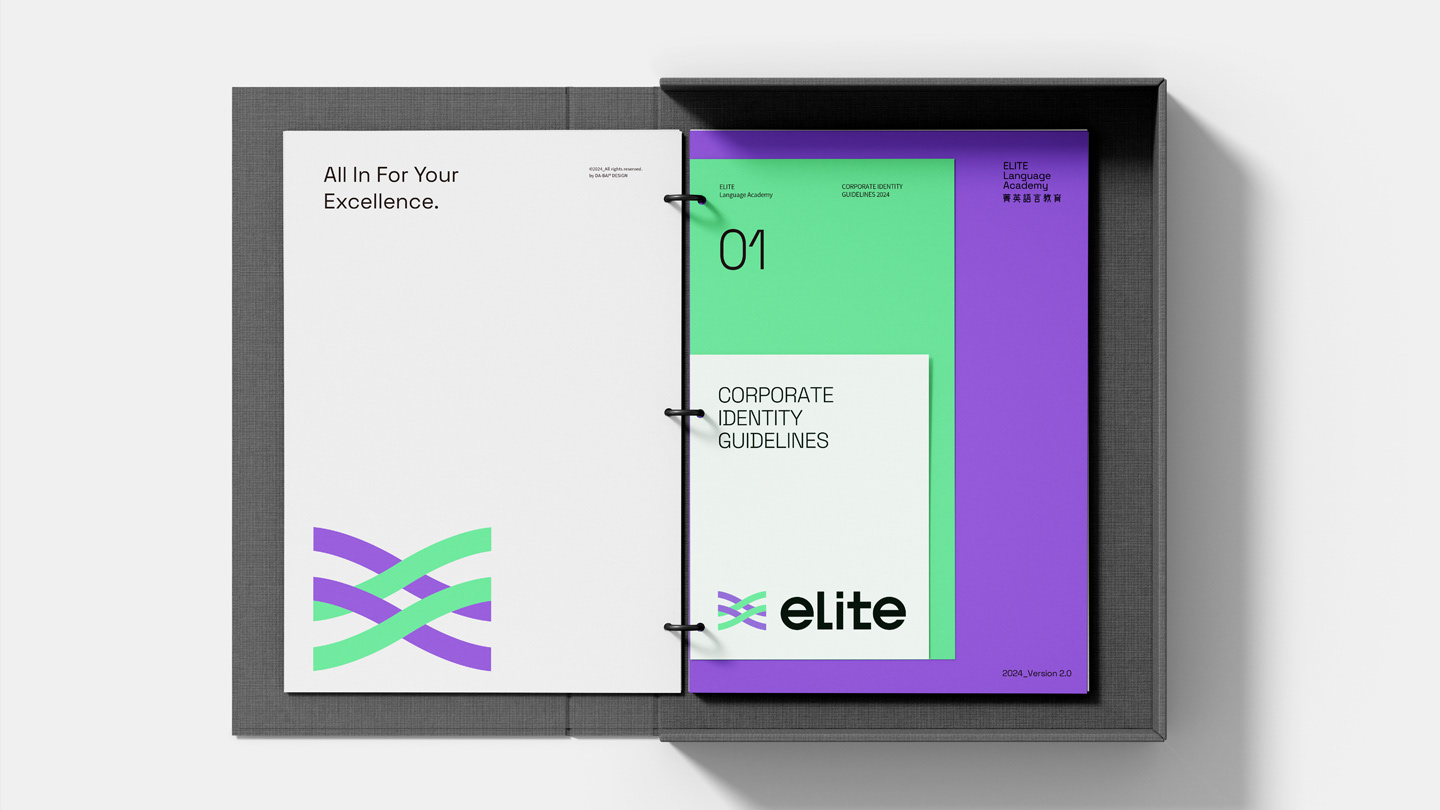
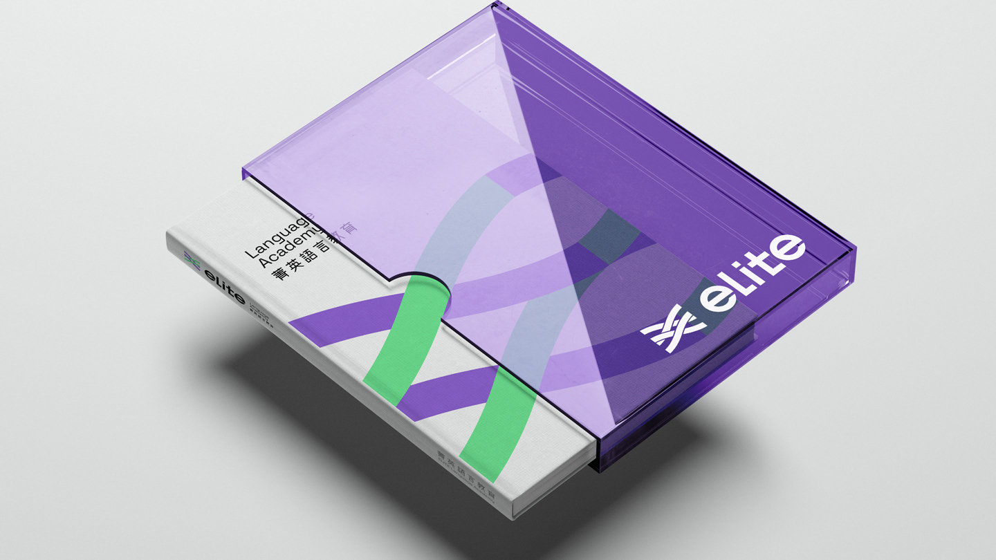
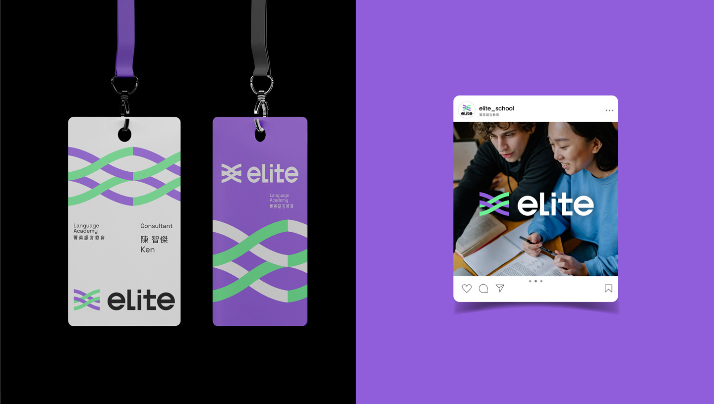
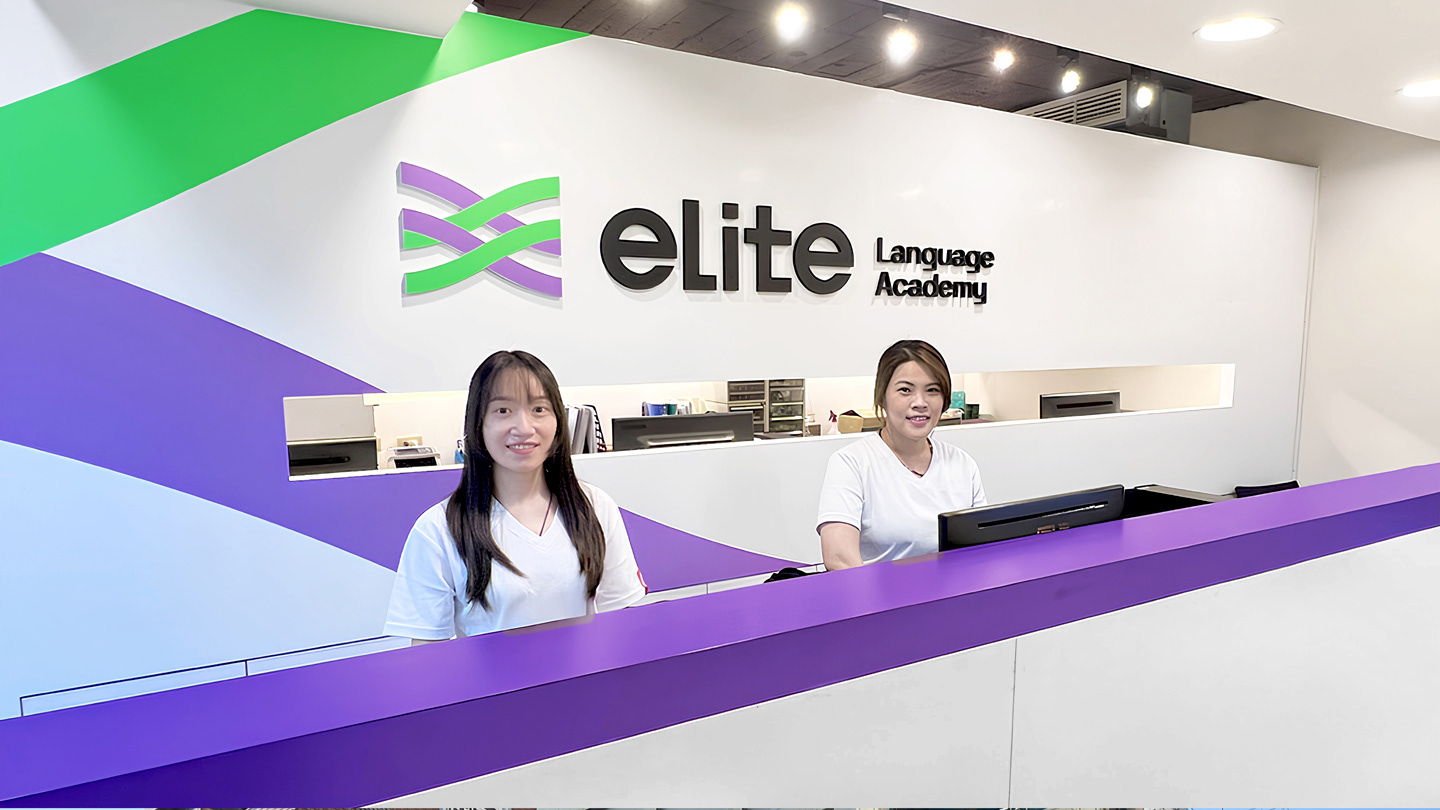
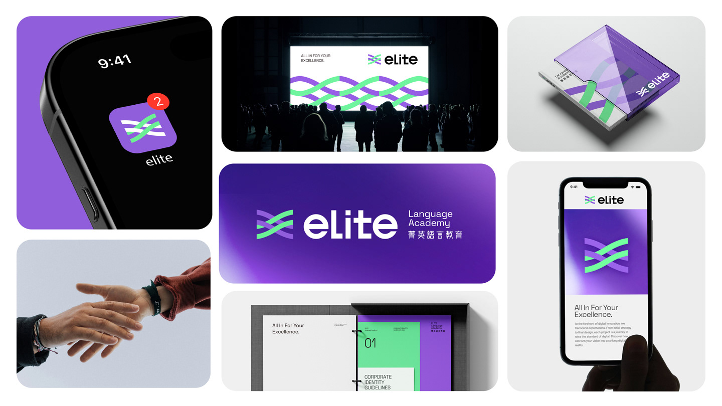
標誌以雙色線條交織而成,象徵「菁英」從帶跑轉變為陪跑的過程,以循序漸進的方式手把手引領學員成長,攜手共創卓越成就的意象。明亮的紫色延續了菁英的品牌專業性,搭配數位感的綠色傳遞菁英積極正向的品牌個性,同時交織的符號也象徵菁英的線上線下「混成學習」教學策略,幫助學員取得卓越成就。 品牌標準字體以客製化黑體字為主。 小寫的英文字母設計給人溫暖親切的感受, 瘦高的結構和簡化的筆劃使整體視覺更為年輕俐落,搭配中文外圓內方的細節處理,呈現菁語言教育的人文感及專業可靠的品牌特質。
The logo is composed of two interwoven lines, symbolizing ELITE’s transformation from leading the way to running alongside its learners. It represents a step-by-step, hands-on approach that guides students through their growth journey, reflecting the spirit of co-creating excellence. The bright purple carries forward the brand’s sense of professionalism, while the digital-inspired green conveys ELITE’s energetic and positive personality. The intertwined lines also represent the brand’s hybrid learning strategy, integrating online and offline education to help learners achieve outstanding results. The brand logotype features a customized sans-serif typeface. The use of lowercase English letters gives a warm and approachable feel, while the tall, slim structure and simplified strokes create a clean and youthful appearance. The Chinese characters combine rounded exteriors with square interiors, reflecting ELITE’s human-centered values as well as its reliable, professional brand identity.
客戶品牌│菁英國際文教事業 ELITE International Education
品牌策略│Shawn Chiao
創意團隊│DA BAI® 大白設計
品牌設計│Ken